How to Visualize Data in a Model
This is one of my favourite visual components in Grasshopper. It's not anything special but I just like the idea of displaying a legend beside a 3D model. It feels so futuristic to me.
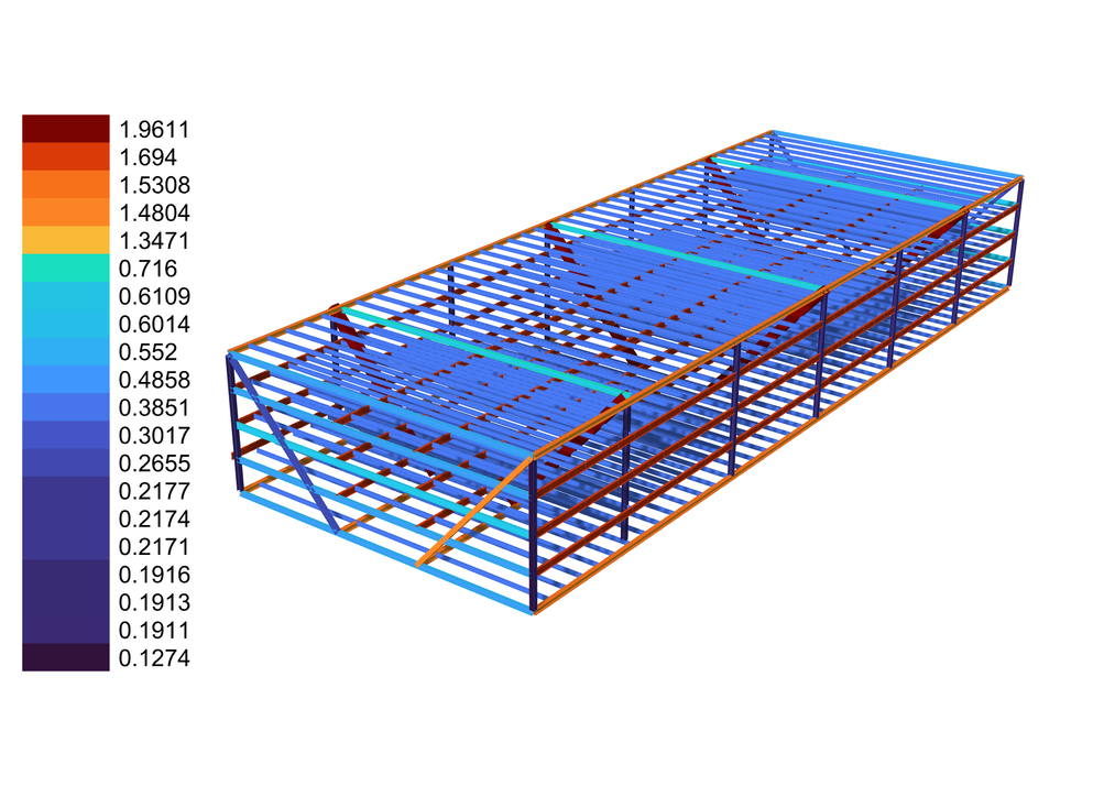
If you have any values or properties that you would like to display along with your models, this is the best way to do it. You can colour code your model and use those same colours to build a legend on the side of it. Visually, I think it looks awesome.
How does it work ?
Like most things in Grasshopper, there are a few ways to display a legend in Grasshopper. My favourite way and its the way I'm going to show you today, is using Proving Ground's Conduit UI components.
Its actually more complicated that it needs to be. And to setup a simple legend actually takes a lot of setup, because Conduit gives you a lot of control on where to place things. The good news is that once you know how it works, applying it to other scripts is just plug and play. Here's how it looks like:
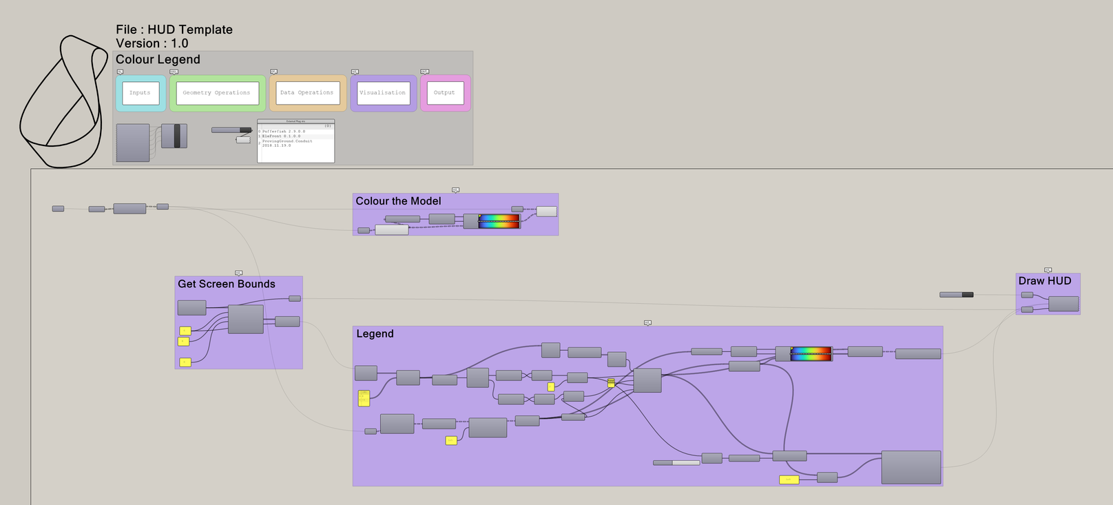
You could make some parts of this workflow a cluster but I found that there was too many inputs and it always depended on what you're trying to display. Maybe someone smarter than me can figure out how to do that, but for now, this workflow works well.
Step 1 : Divide your screen
First thing first, we need to get the bounds of the current Rhino viewport as a rectangle. Then, we want to divide this rectangle into cells. You can do all of this with Conduit's components.
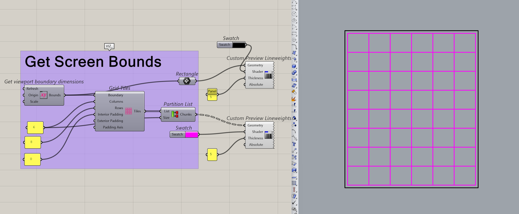
I chose 6 columns and 8 rows because for a full screen Rhino view, that's what looks best to me. But this component updates based on the size of your Rhino view, so if you have it on half of your screen, you'll get a more square-ish rectangle, like what I have in the picture above.
Step 2 : Pick your cells and divide them again
Now, we need to pick the cells the legend should appear. Remember, these cells represent the location on your actual Rhino screen itself. So picking the cells is like picking where to put the legend on your screen.
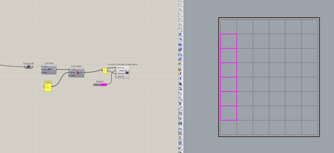
Once, we have our picked cells, we know the bounds of where the legend will be. To actually get the legend to show up in that area, we need to either create smaller boxes in these cells (for a segmented legend) or we want to mesh this region (continuous legend).
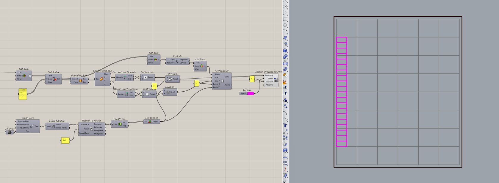
I know it's a lot to digest, but if you look closely. I am just taking the bounds of the picked cells and then dividing them by the number of values I want to show in the model. I also split the cells in half (vertically) because I need to make room for the text.
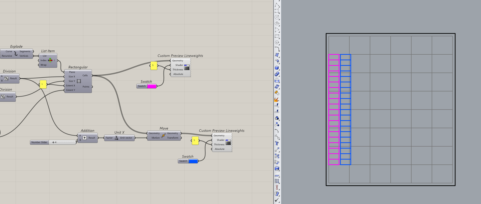
The pink boxes are where the colours will appear and the blue is where the text will appear.
Step 3 : Mesh and Add Text
Okay, rejoice because that was hard part. Once you have these rectangles, you can assign them values and colours that make up your legend.
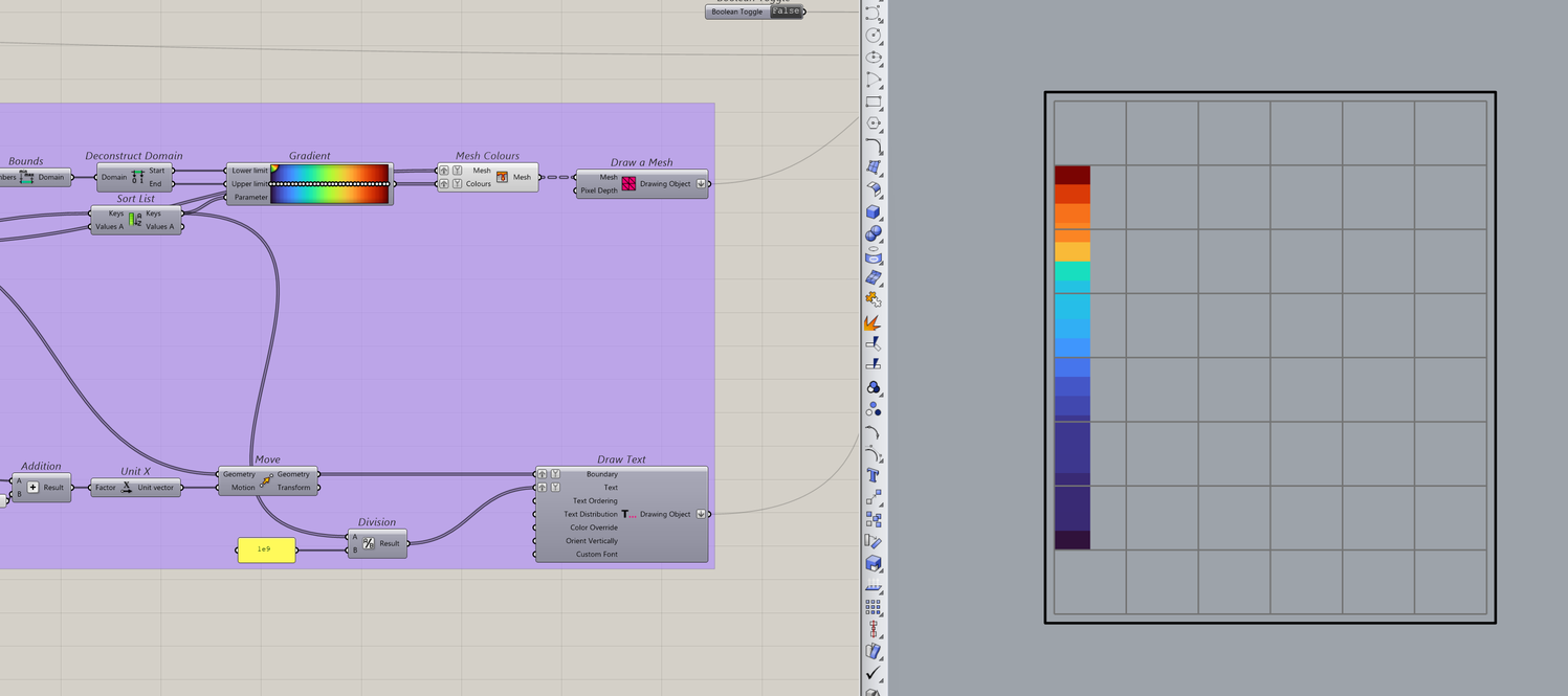
Step 4 : Display the legend
Then, it's a simple matter of just turning it on.
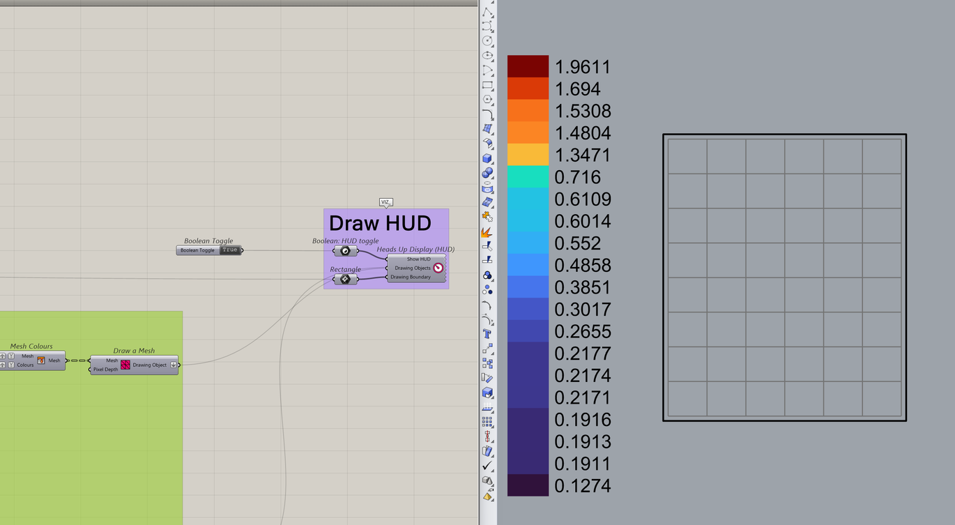
From here, you can tweak it depending on what you want to show. You can make it wider or taller by changing your picked cells. You can add a title by choosing a cell and displaying a text on that. Really, you have full control over where and how it looks.
Final Thoughts
I know it seems a lot of work for a legend. Especially since, every time I needed a legend, its when I I am rushing to produce a visual someone. It's never fun. But when I took a step back and made this workflow, it's been an investment that has paid off time and time again because it makes any visuals look really good.
Okay, that’s all for this week.
I'll see you next week,
Braden.
P.S. If you have any specific workflows or resources you'd like me to break down in future emails, just reply and let me know!
P.P.S Sorry no new additions this week, life has been very busy
